Re: CV and mad panic behaviour

Reply #5349 –
They often leave out one important point when discussing the limits of knowledge in studies. With any drug or vaccine the size of the cohort produces a synthetic result similar to a longer or shorter term study, so a 350,000 cohort for 120 days "might" produces results that scale to be be equivalent to a 35,000 cohort for 1200 days.
I write 'might' because it is variable based on the long term characteristics of a disease. For example a disease that presents in hours versus one that presents in weeks. So the ratio isn't a hard and fast indicator, but the scaling effect is still very real.
The reason for this is that while science talks about side-effects and immunity appearing on average, the side-effects really present across time as part of a normal distribution. That is some small percentage of any initial long term effects would present early well ahead of the average FWHM. So the bigger the study, the sooner you know there will be some long term side effects.
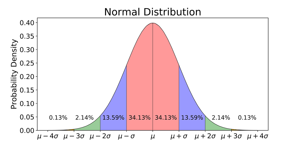
In the case of Sars-CoV-2 vaccines they are being issued in the hundreds of millions of doses, larger than any cohort study ever conducted before. Due to the high number of doses issued, early acute long term side-effect cases would already be presenting in significant numbers, not in tens or hundreds of people, not one here or there as FB or Tic Tok try to make out, but in hundreds of thousands or even millions of people already. The area in green on the left of this graph.
When hundreds of millions of vaccines doses have already been issued, those little green areas on the lead or tail of the bell curve graph would represent millions of people with early or late presentation of acute long term side-effects if any existed. As yet they just haven't presented in any significant number, and are unlikely to now that so many doses are issued, but as the doctor points out correctly the risk can never be zero.
So you can take solace the vaccines are likely very very safe, perhaps the safest humanity has ever made!
Just an aside, if the graph was global COVID cases, those little green areas would be the number of people dying, at the moment that sits at about 4.8M deaths!
 Topic: CV and mad panic behaviour (Read 2424426 times)
previous topic - next topic
Topic: CV and mad panic behaviour (Read 2424426 times)
previous topic - next topic